
About this section
Essay Collections
Cancer Research
Clinical Practice
Papers on Journal Publication
Papers on Digital Health Systems
Military Medicine and Strategy
Multimedia

Download
PDF
Design and implementation of the stacked, synchronised and iconographic timeline-structured electronic patient record in a UK NHS Global Digital Exemplar hospital
Alan Arthur Hales,¹ David Cable,¹ Eleanor Crossley,² Callum Findlay,² David Anthony Rew ²
ABSTRACT
Background: Conventional electronic screen visualisation formats, which use tabs, dropdown menus, lists and multiple windows, present huge navigation challenges to health professionals. A unifying and intuitive interface for the electronic patient record (EPR) has been an elusive goal for software developers for decades.
Methods: Since 2009, by working in an agile way, we have built and implemented a fully operational and dynamic system, the University Hospital Southampton Lifelines (UHSL), within our clinical environment, in a UK university hospital. UHSL permits the continuously updated integration of client records and results, displayed in an intuitive format. During this iterative evolution, we have resolved a number of practical challenges in data display, while maintaining our core aims of end-user optimisation and radical simplification of the interface. Consequently, we have upcycled a significant volume of clinical e-content, some from as far back as 1981, into UHSL, and at a marginal cost.
Outcomes: UHSL went live in 2017 for all authorised staff at the hospital. It displays all e-records for 2.5 million patients and for more than 100 million documents and reports. It significantly reduces the screen time to navigate the individual EPR, and it offers substantial productivity gains in designated clinical scenarios.
Conclusions: UHSL has considerable further development potential as a National Health Service EPR interface, for the integration, display and ease of understanding of medical records across primary, secondary and community care.
INTRODUCTION
Healthcare systems across the world are engaged in an epochal transition from paper to digital systems. A unifying and intuitive interface for the electronic patient record (EPR) has been an elusive goal for software developers and clinicians for decades. Paper is a technology for information transfer which has evolved over many centuries, with many powerful features which are well adapted to the human brain. Digital systems offer many advantages over paper, but they also bring many challenges in the organisation and presentation of clinical data to health professionals without resulting in data overload. Conventional electronic screen visualisation
Summary
What is already known?
- The search for a simple unifying and efficient architecture for the ‘whole of life’ electronic patient record (EPR) for each and every citizen has so far proved elusive.
- Current and legacy computer-based graphical user interfaces are not optimised for the visualisation and interpretation of the EPR.
- The need to open multiple tabs, windows, screens and PDF documents can impede information retrieval, comprehension and decision making, when compared with traditional paper records.
- Poor EPR design which is not focused on the true visual and cognitive needs of the end user creates avoidable clinician risk, fatigue, operational inefficiencies and reduced healthcare productivity.
What does this paper add?
- The University Hospital Southampton (UHS) Lifelines represents a new approach to the presentation and visualisation of electronic clinical records, using multiple timelines and icons to represent documents, events and reports.
- It permits all records to be consolidated on a single computer screen, optimising human visual pattern recognition to permit intuitive comprehension, navigation and decision assistance.
- It provides overview, zoom and filter functions, with real-time and direct access to the details on demand of selected electronic document content over short and long timescales.
- It has proved sufficiently promising in beta testing that it was adopted directly into the primary EPR for all records and all authorised users at UHS in 2016.
© Author(s) (or their employer(s)) 2019. Re-use permitted under CC BY-NC. No commercial re-use. See rights and permissions. Published by BMJ.
¹ Information Management Directorate, University Hospital Southampton NHS Foundation Trust, Southampton, UK
² Surgery and Critical Care Information, University Hospital Southampton NHS Foundation Trust, Southampton, UK
Correspondence to Dr David Anthony Rew; d.a.rew@soton.ac.uk
To cite: Hales AA, Cable D, Crossley E, et al. Design and implementation of the stacked, synchronised and iconographic timeline-structured electronic patient record in UK NHS Global Digital Exemplar hospital. BMJ Health Care Inform 2019;26:e100025. doi:10.1136/bmjhci-2019-100025
Received 8 April 2019
Revised 11 November 2019
Accepted 03 December 2019
formats, which use tabs, dropdown menus, lists and multiple windows, present substantial comprehension challenges to end users. Digital systems for professional healthcare applications are as yet rarely developed to robust user interface standards to optimise them for the perceptual capabilities of the human user.
The UK Government Digital Service has transformed our understanding of the principles of development of public sector information systems since 2010. It has placed prior discovery of the true needs of the end user at the centre of all digital system developments.
‘Digital by Design’ enshrines the intent to make all Information Technology (IT) systems so functionally compelling and satisfying to use (‘Digital by Default’) that they will always be the user’s system of choice, rather than through organisational convenience and compulsion (‘Digital by Diktat’). It also enshrines the core principle that the benefits of digitisation lie not in replicating the paper process in code, but in new approaches to information management that deliver greater functionality than is possible with paper.
Computer-assisted data visualisation strategies in effective IT system design
The human occipital cortex subconsciously processes huge volumes of visual information with greater speed and comprehension, compared to static, alphanumeric content. This biological truth is captured in the old aphorism that ‘a picture is worth 1000 words’. Edward Tufte has played a major part in advancing our awareness of the power of data visualisation.
Computer-assisted data visualisation is a fertile area for practical adaptation. The digital age of the modern age mandates new approaches to the adaptation and presentation of digital information to the human brain, if the end user is not to be overwhelmed with digital noise.
Professor Ben Shneiderman, Dr Catherine Plaisant and their team at the Human Computer Interaction Laboratory (HCIL) of the University of Maryland in the 1990s reported an information architecture to support the visualisation of personal histories, which evolved into the HCIL Lifelines model for visualising a clinical history, which was not further exploited at the time.
Shneiderman’s ‘Mantra’ of data visualisation sets out the functional requirements of a system for the visualisation of a complex, large and/or heterogeneous data set. It is listed to the following system tasks; ‘Overview, Zoom, Filter, and Details-on-Demand’.
The abstraction of knowledge, insight and actionable intelligence to drive optimal clinical decision making is rarely derived from one document or page in the individual clinical record. Instead, it often emerges from the temporal relationships of a number of documented events, in parallel with investigations and information on comorbidities, which tell a richer story.
Adaptation of the HCIL Lifelines model to our intent
We were particularly influenced by two projects in the 1990s from the HCIL Maryland team:
- The HCIL Filmfinder model showed us how to compress a large data set onto a single screen and how a single icon could be used to open a window to a large volume of content.
- The HCIL Lifelines model provided the conceptual framework for our concept of EPR.
The Lifelines concept describes a stacked and synchronised series of timelines on the Y axis of the interface, and time is plotted along the X axis. Interactive icons are displayed in time and place on the graphic, according to their allocated time and subject metadata.
In consequence, UHS Lifelines (UHSL) is dynamic both in time and in functional adaptability. The timeline evolves continuously, and new icons are added directly as the underlying documents are generated and authorised. New timelines can be added as new data sources on new subjects become available.
Lifelines and the University Hospital Southampton clinical data environment
The University Hospital Southampton (UHS) IT programme has considerable autonomy for innovation within the UK National Health Service (NHS) digital transformation programme. Since the mid-1990s, the UHS IT department’s approach has been to establish a central data warehouse, in which every piece of correspondence has its subject field and date-time stamp has been applied to each item, according to a long-established clinical subject taxonomy.
By 2009, the hospital had amassed a large quantity of clinical documents and reports on more than two million patients. However, the clinical user experience of the IT system had not kept pace. Digital documents were primarily accessed through standard legacy computer interfaces. These make for a slow and taxing user experience in clinical service, where large volumes of time-structured information from multiple subject fields need to be assimilated and acted on in a short timeframe.
We recognised the potential of the HCIL Lifelines model as a core framework for our evolving EPR. In this paper, we describe the development of the resulting clinical data visualisation system, the UHSL, which:
- Offers overview, zoom, filter and details on demand functionality.
- Is truly ‘Digital by Design’ through its relentless focus on end-user optimisation.
- Substantially simplifies the challenges of clinical data visualisation of longitudinal data over decades from many subject fields.
METHODS
Our digital infrastructure and tested
The UHS clinical data environment (CDE) comprises a complex and unique architecture of legacy computer systems to serve a wide variety of operational needs.
Open access
Box 1 Document and data feeds into UHS Lifelines as of September 2018
UHS clinical disciplines supplying clinical documents to UHS Lifelines:
- Surgery.
- Medicine and elderly care.
- Cancer care.
- Trauma and orthopaedics.
- Cardiovascular and thoracics.
- Obstetrics, midwifery and gynaecology.
- Child health.
- Ophthalmology.
- Emergency department.
- Neurosciences.
- Dermatology.
Clinical documents from partner healthcare units.
- The local independent sector treatment centre (run by Care UK).
- Southern Health NHS Trust (community health services in Hampshire).
- Solent NHS Trust (community health services in Hampshire).
Departmental results of tests and imaging.
- Histopathology and cytopathology reports.
- Endoscopy attendances.
- Nuclear medicine reports.
- Radiology reports (including plain X-rays, CT, MRI, mammograms and ultrasound scans).
Miscellaneous information.
- All discharge and inpatient admissions (from our patient administration systems).
- Miscellaneous administrative documents.
NHS, National Health Service; UHS, University Hospital Southampton.
With major software projects, the iteration is open-ended, adapting to inevitable changes in IT circumstances and systems. As such, an agile development project is quite unlike a conventional clinical research project or a clinical trial, where the end points are clearly defined in advance, or a clinical cohort study, when the cohort size is finite and defined.
Our ‘agile’ team comprised the concept lead and clinical end user (DAR), working iteratively with the system consultant and programming lead (AAH), who in turn had a long history of engagement and intimate knowledge of the UHS CDE as its principal designer. This proximity and mutual understanding of the user and of the system engineer and the harmonisation of the probabilistic thinking of the clinician and the creative but rigid linear demands of the system engineer were a key element in the success of the project.
By the nature of the project, it was initially optimised for a surgical outpatient service, with a focus on documents, histopathology reports and imaging reports. However, the wider utility of the system to the clinical service became apparent as we recruited more timelines and more content.
Our philosophical approach was to use a browser-based system which is accessible from any personal computer on the local and wide area network. This eliminates the need for specific software installation or configuration and additional licensing costs. Documents and reports stored in the underlying system are streamed at will. The user interface is delivered as pages encoded with HTML (hypertext mark-up language). The current version of UHSL is a C#.NET (Microsoft) application with data sourced from an Oracle 11g relational database.
The selection of content for display on UHS
In 2009, we initiated an unfunded, curiosity-driven research and development project to develop a timeline-structured EPR interface within the UHS CDE. We named this UHSL in recognition of the intellectual origins of the programme in the Maryland concept. We were constrained and pragmatic in the use of the available data resources of documents and reports, which were in effect ‘upcycled’ into the new visualisation format. We adopted the following general design objectives for the system, in that it should:
- Be optimised for the specific needs of the end user (in this case, an outpatient clinician), intuitive usability criteria and qualitative feedback.
- Display all available clinical e-documents and reports in a logical framework.
- Fulfil Shneiderman’s mantra for visualisation of the entire data set.
- Be visually rich, dynamic and interactive, and accrue new content in real time.
- Work fast and seamlessly within the UHS CDE.
- Be intuitive in daily use, to maximise voluntary uptake by the workforce and to minimise the costs of training and implementation.
Be economic to iterate and continuously adaptable to future needs and data resources.
These principles individually and collectively define the agile development process, through which each iteration leads to the next step.
The subject taxonomy for the UHS1 timelines
Each timeline is specific to a clinical discipline and subject content. Our own standard clinical document taxonomy was established at UHS in the 1950s in the era of paper records. Farsightedly, metadata was applied progressively to key clinical digital documents and e-reports across the UHS CDE from 1995 onwards. The taxonomy of content for UHS1, as of late 2018, is as shown in box 1.
Reactivation of histopathology records back to 1990
Our digital cytopathology and histopathology records date back to 1990. They were archived in a variety of legacy formats. We were able to reactivate and upload on to UHS1 some 500,000 archival records which were otherwise ‘lost’ to our clinicians.
The live version of UHS1 (2016 onwards)
A workable alpha version was built in Microsoft Active Server Pages (ASP) code by mid-2010, following which it underwent continuous and iterative testing in various configurations in DAR’s clinical service in outpatient, inpatient and multidisciplinary team configurations. By 2015, it was clear to us that UHS1 could make a valuable contribution to the fast-evolving UHS digital strategy. It enables clinicians to identify pertinent information at speed to support our strategic aim to provide clinicians with more face time with their patients. We ‘soft launched’ UHS1 as a ‘Public Beta’ module into the UHS proprietary CHARTS EPR in late 2016. This enabled us to resolve a number of display and navigation issues. Agile development continues.
Key technical and design features of the current version of UHS1 (since 2015)
Display options for the overview screen
We consider it important to show the Overview Screen when any patient record is opened. This is because the Overview Screen:
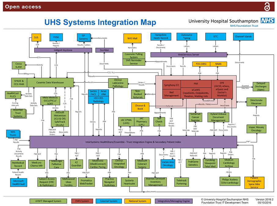
Figure 1 This 2016 systems integration map of the UHS digital infrastructure illustrates the complexity of a typical hospital IT system of systems, and by inference the requirement for common user interface which integrates information for the clinical user from a wide range of different systems. Courtesy of Ian Brewer, UHS IT, Information technology; UHS, University Hospital Southampton.
- 'Tells the story' of the patient's health most efficiently.
- Displays key information which the user might not otherwise seek out under time constraints in a busy clinic.
- Minimises the risk that the clinician will miss key information in the record, under the pressure of time, when compared with the demands of opening multiple tabs and windows in legacy data display systems.
- Filters Out timelines which hold no data, so that the user sees all available information most efficiently and without having to open 'blind' tabs.
- Allows the user to Zoom In and access Details on Demand for any document, event or report of any age and in real time.
The calendar timeline reset function
The overview default screen permits the display of 28 years of documents in one full-screen view. On pragmatic grounds for efficiency of display, we offer users a default view of the past 2 years of data. All prior events are listed on their timelines on the left hand end of the display. A ‘Calendar’ date (month/year) selector tool permits a rapid reset to any earlier date.
Display of icon metadata
The iconography is arbitrary in design, but it is easily read: clicking on each icon opens up the document which ‘underlies’ it. Hovering on the icon displays the metadata for that document or report in a ‘balloon’.
Continuous iteration and adaptability
Our ownership of the UHSfL code permits much faster iteration, fixes and updates than is usually possible with large commercial systems.
Managing the problem of icon overload and clustering on timelines
As document numbers increase, more than one document may occupy the same point in space and time on any one timeline ("Clustering"). In our system, each icon occupies 12x12 pixels of physical screen space on any timeline. We have considered and tested a number of possible solutions to this problem. In our 2010 iteration (V.1), multiple icons were allowed to overlap, but they progressively obscured each other as numbers of color-coded icons built up (see